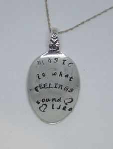
My Font Choices
I have a love how using different fonts can change the look of a piece of jewelry. I enjoy giving you as many lettering styles to choose from as I can. Each font does behave differently, and not every font is appropriate for every design, so if you have any questions at all, please contact me. As I add fonts and stamps, I will add them to this page.
Here are some examples of how each font looks on various pieces of jewelry:
Arial
Arial is the basic block lettering and an easy to read font, Arial is an uppercase sweetheart who knows how to have fun while being very readable. Bonus: numbers are available!
Script
A typeface with a personal touch, This font is perfect for elegant to light-hearted types of jewelry with rounded forms for a fresh, peppy look. Upper and lowercase is available.
Arcadia
Arcadia™ was designed by British graphic design guru Neville Brody, originally as the banner for Arena magazine in 1986. Borrowing elements from Art Deco styling, Arcadia is a tall and striking geometric design with extremely condensed and contrasting forms. Arcadia lends eye-popping elegance to your statement jewelry.
Minuscule
A tiny 2 mm tall font with a lot of character. Similar to a block type font, Minuscule features upper and lower case letters. Pictures soon!
Bridgette
A typeface with a sweet personal touch, This font is perfect for elegant to light-hearted types of jewelry with rounded forms for a fresh, peppy look. Numbers only at this point. Pictures soon!


